From the pages of early print to today’s high-resolution screens, sans serif fonts have traveled through centuries of design evolution. Once dismissed for lacking elegance, they’ve become the visual language of clarity, innovation, and universality. 1. From Industrial Roots to Modernism Sans serifs first appeared in the 19th century — bold, functional, and built for …
UI design

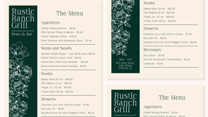
Mastering Font Hierarchy: How to Create Visual Order in Your Design
Typography isn’t just about choosing beautiful fonts — it’s about creating structure and meaning. Font hierarchy is the system that guides your viewer’s eye from most important to least important information. Without hierarchy, even the most elegant typefaces can look cluttered or confusing. Understanding how to establish visual order is one of the key skills …
How to Combine Fonts Like a Pro: The Art of Type Pairing
1️⃣ Introduction — The Secret Language of Type Pairing Mixing fonts can make or break a design.A well-balanced pairing helps communicate tone and hierarchy effortlessly, while a poor one can confuse or overwhelm the viewer.Whether you’re creating a logo, packaging, or editorial layout, mastering font pairing is one of the most powerful visual skills a …
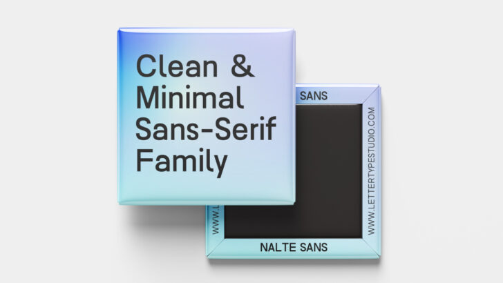
The Rise of Minimal Sans-Serif Fonts in 2025
✦ The New Era of Simplicity In 2025, design has shifted toward purposeful simplicity. The once-dominant maximalist aesthetic — filled with gradients, mixed serif-sans pairings, and experimental lettering — is giving way to clarity and focus. Brands today seek fonts that communicate honesty, reliability, and modern sophistication. That’s where minimal sans-serif fonts step in. Minimal …