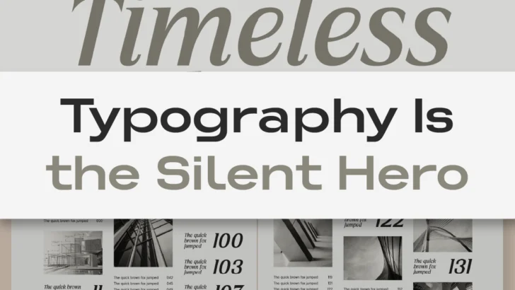
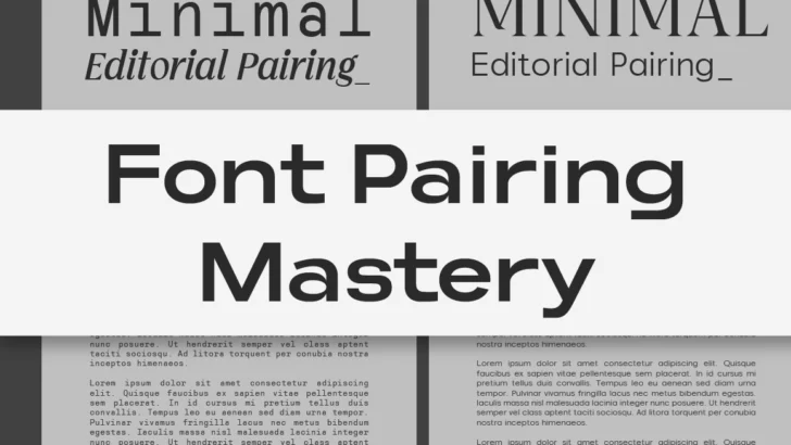
modern design

Font Pairing Mastery: How to Match Typefaces Like a Pro

✨ Font Pairing Mastery: How to Match Typefaces Like a Pro

Introduction: The Silent Dialogue Between Fonts Every great brand tells a story — not only through its words, but through the subtle dialogue between its typefaces. A headline might shout confidence, while the subtext whispers warmth and familiarity. The perfect pairing doesn’t happen by accident; it’s a quiet dance between form, tone, and rhythm. As …

Continue reading →

Cirvia-Preview-Healty-Lifestyle-Poster

Mastering Font Hierarchy: How to Create Visual Order in Your Design

Typography isn’t just about choosing beautiful fonts — it’s about creating structure and meaning. Font hierarchy is the system that guides your viewer’s eye from most important to least important information. Without hierarchy, even the most elegant typefaces can look cluttered or confusing. Understanding how to establish visual order is one of the key skills …

Continue reading →

Editorial typography layout in digital magazine design

Editorial Typography in the Digital Age

✦ From Print Roots to Digital Screens Typography for editorial design has always carried weight. Decades ago, magazines and newspapers relied on letterpress and serif-heavy layouts to convey authority and clarity. But as design shifts to the digital space, the same principles evolve — not disappear. Modern editorial typography now lives across screens: websites, tablets, …

Continue reading →

Choosing the right font for your brand – Lettertype Studio typography guide"

Choosing the Right Typeface for Your Brand

Fonts are more than visual elements — they’re emotion, rhythm, and tone, all packed into shapes we call letters. Every curve and line carries a message. That’s why choosing the right typeface isn’t just a design decision — it’s a storytelling one. At Lettertype Studio, we believe typography has a voice. Some fonts whisper sophistication, …

Continue reading →