LTS

Editorial typography layout in digital magazine design

Editorial Typography in the Digital Age

✦ From Print Roots to Digital Screens Typography for editorial design has always carried weight. Decades ago, magazines and newspapers relied on letterpress and serif-heavy layouts to convey authority and clarity. But as design shifts to the digital space, the same principles evolve — not disappear. Modern editorial typography now lives across screens: websites, tablets, …


Continue reading →

Modern clean minimal sans-serif font trends 2025 design inspiration

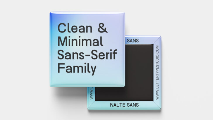
The Rise of Minimal Sans-Serif Fonts in 2025

✦ The New Era of Simplicity In 2025, design has shifted toward purposeful simplicity. The once-dominant maximalist aesthetic — filled with gradients, mixed serif-sans pairings, and experimental lettering — is giving way to clarity and focus. Brands today seek fonts that communicate honesty, reliability, and modern sophistication. That’s where minimal sans-serif fonts step in. Minimal …

Continue reading →