design tips

How to Choose the Right Font for Your Visual Identity

đź§­ How to Choose the Right Font for Your Visual Identity

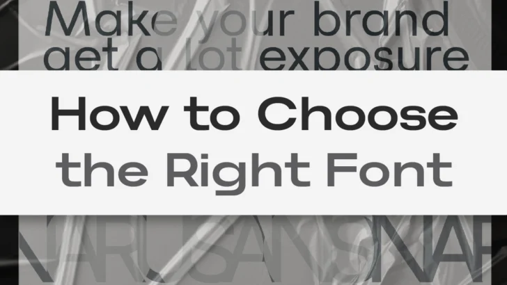
Introduction: Every Brand Has a Voice — Typography Is How It Speaks When you build a visual identity, the first question is never “What color should we use?” — it’s “How should it feel?”That feeling begins with typography. Every font has a story. Some whisper elegance, others shout innovation, and a few embody quiet confidence. …

Continue reading →

Font Pairing Mastery: How to Match Typefaces Like a Pro

✨ Font Pairing Mastery: How to Match Typefaces Like a Pro

Introduction: The Silent Dialogue Between Fonts Every great brand tells a story — not only through its words, but through the subtle dialogue between its typefaces. A headline might shout confidence, while the subtext whispers warmth and familiarity. The perfect pairing doesn’t happen by accident; it’s a quiet dance between form, tone, and rhythm. As …

Continue reading →

Typography weight and spacing defining brand personality visual guide

How Font Weight and Spacing Define Brand Personality

✦ Every Letter Speaks Emotion Typography isn’t just design — it’s language without words. When you change a font’s weight or spacing, you’re shifting how a brand feels.A bold, tight sans-serif radiates confidence and modern strength. A light, airy serif whispers elegance and trust. Even small tweaks in letter-spacing (tracking) can transform perception: wide spacing …

Continue reading →