✦ From Print Roots to Digital Screens
Typography for editorial design has always carried weight. Decades ago, magazines and newspapers relied on letterpress and serif-heavy layouts to convey authority and clarity. But as design shifts to the digital space, the same principles evolve — not disappear.
Modern editorial typography now lives across screens: websites, tablets, and social media carousels. The designer’s challenge? Balancing readability and personality while adapting to different resolutions, layouts, and devices.
✦ Serif or Sans: It’s About Context
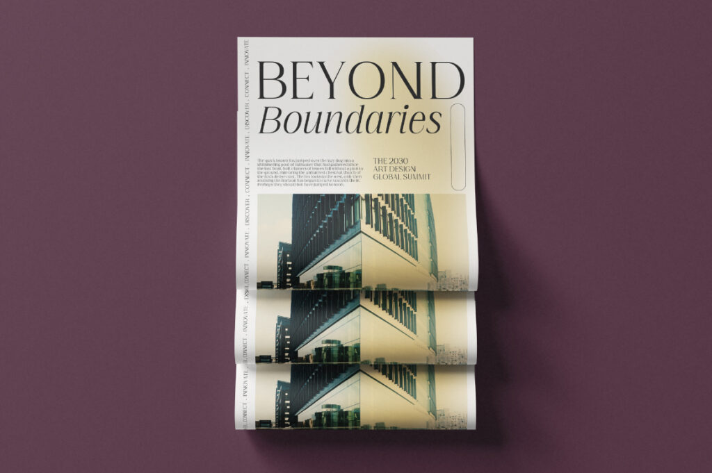
Digital editorial design doesn’t reject serifs; it reinterprets them. Classic serifs like Cirvia evoke trust and sophistication for long-form reading, while clean sans-serifs like Prolinea and Lugio Sans give a crisp, modern look to digital magazines and brand blogs.
The best designers blend both worlds — using serifs for storytelling and sans-serifs for hierarchy, captions, or pull quotes. This hybrid approach brings warmth and structure together, ensuring the typography complements the message rather than competes with it.
✦ Typography as User Experience
Editorial design on screens isn’t only about aesthetics; it’s about comfort.
Line height, column width, and contrast matter more than ever. Readers skim, scroll, and interact differently online, so typography has to guide the eye instead of just decorating the page.
Responsive typography — adjusting type size, line spacing, and grid automatically — has become a standard. In this new era, designers aren’t just typesetters; they’re experience architects.
✦ The Future Is Adaptive
As digital platforms evolve, so does editorial typography. AI-assisted layout tools, variable fonts, and smart grids will soon allow real-time adjustment of type hierarchy based on reader preference or device type.
Lettertype Studio continues to explore this balance — designing typefaces that perform beautifully in both long-form editorial pieces and dynamic digital layouts. The future of editorial typography isn’t about abandoning tradition; it’s about translating it.

